|
This project is my lidded project. It's glazed clear on the outside and shadow green on the inside. The bright green color on the inside and the clear/beige color on the outside create contrast between the interior and exterior of the pot and makes the inside of the pot a little bit more unexpected when the lid is removed, While creating this project, I learned how to measure the lid and pot so that they fit together well, I also learned that the shadow green glaze needs multiple coats to really show up, so this was my first project that used shadow green well. 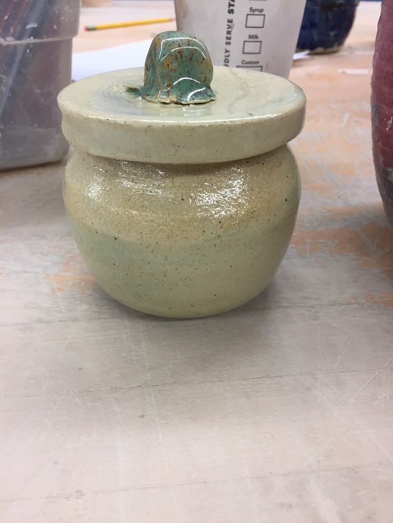 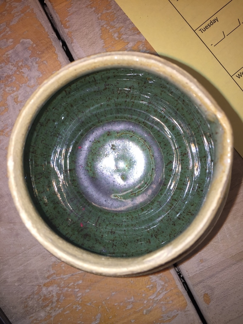
0 Comments
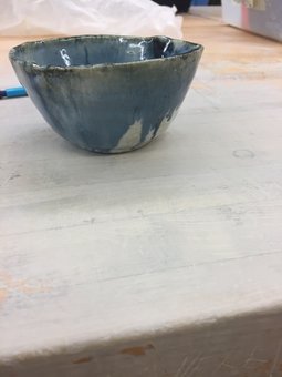
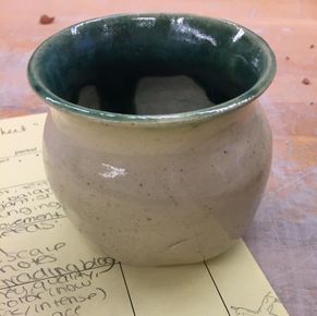 This project is a vase with a sandy beige colored outside and a mostly teal inside that has some bare patches. It is glazed clear on the outside and matte turquoise on the inside. The rougher looking natural texture on the outside of the vase contrasts with the dark, smooth turquoise on the inside to imitate the sudden changes of nature and especially the ocean. While making this project I learned how to properly choke in order to create a thinner neck. I also experimented with new glaze combinations.
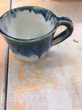 My project is a cup with a pulled handle that's glazed white with drips of black down the sides. The color has a lot of change in the values of the dark glaze, with some parts, like the lip and the handle, being really dark and other parts, like on the inside of the cup, being a lighter value. The contrast between the dark blue/black and the white also creates a pleasant rainy day sort of mood. When creating this mug I learned to glaze so that there are no bare spots and I improved my skills at pulling handles and attaching them so that they flow nicely.
My project is a bowl that was glazed with forest cobalt and black. The result was a very dark bowl with very little contrast in the value. I dipped the piece in half black and half forest cobalt, which ended up differently than I had hoped. The mood of the piece is very dark and gloomy. The bowl itself is very symmetrical, with steep edges and a defined lip. While making this project I learned that glaze choice is very important in determining the mood of a project, and I learned which colors contrast well with each other and which ones don't. I also came to realize the importance of sanding the lip of a project, because even if it feels fairly smooth when it's greenware, when it's glazed all of the little sharp bits are more accentuated. 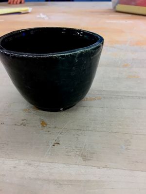 This project is my group coil pot. It is glazed metallic brown, and has a very unique, organic shape to it. The surface of the pot has a very smooth texture, but is also very twisty and similar to twisted roots of trees. We utilized empty space on our coil pot, and also varied the coils from horizontal to vertical in order to create a contrast in the lines we used. We also used different shapes to create pattern in the pot. A skill that we had to learn was rolling the coils in a way that wouldn't cause them to crack, and also slipping and scoring the pieces together securely. 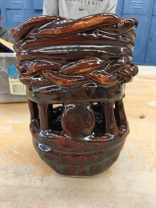
|
AuthorWrite something about yourself. No need to be fancy, just an overview. Archives
May 2017
Categories |
 RSS Feed
